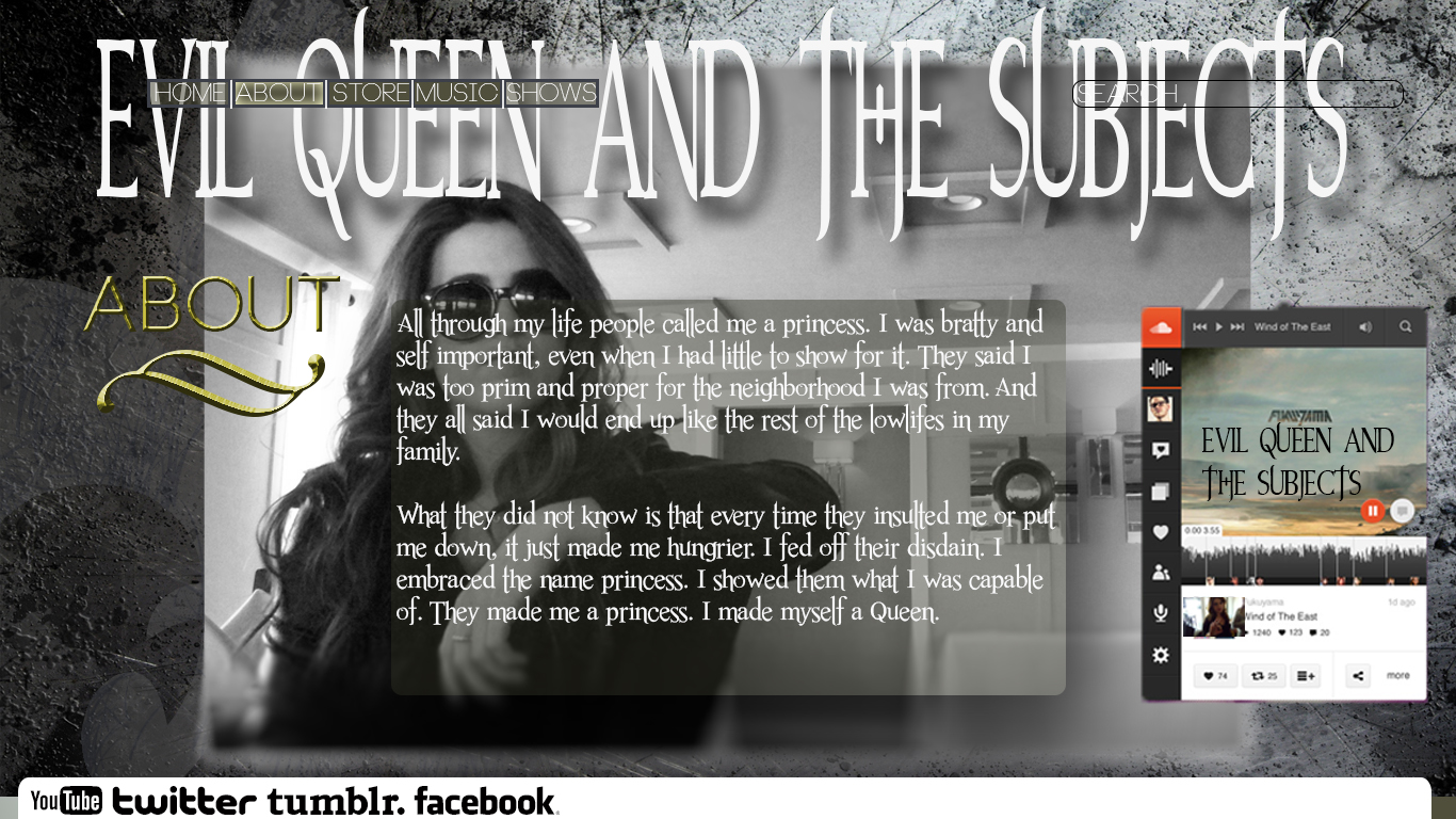
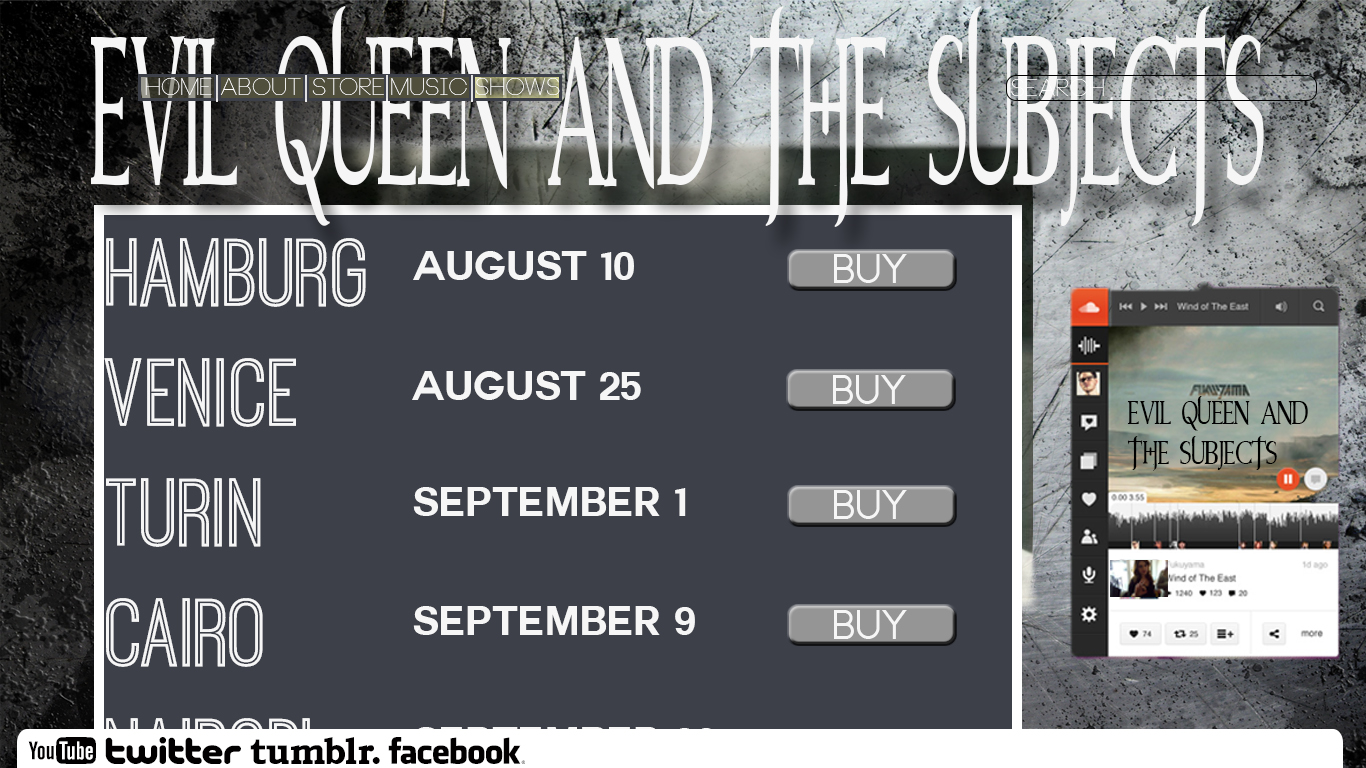
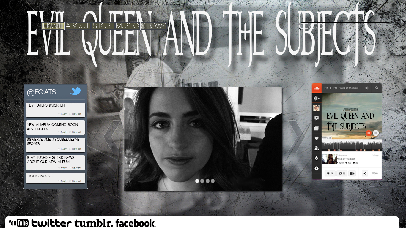
First of all, when I saw your website pages initially I was extremely impressed. They are so eye catching that even if I were not assigned to comment on them, I would have taken the time to look at them. Focusing on the “Store” page I really enjoy that instead of making the background a tradition block color or shape, you took the time to figure out what picture would fit nicely in the background. I also thought that the font you used for your header was really effective for the type of band you were trying to portray, which I am going to guess was some sort of gothic genre. Plus, this element was really effective in uniting all of your pages. Another element that I thought was really clever was taking the time to make a mock snap chat. You can tell that you took the time to put a filter on it, as well as research the font used, to make it realistic. The third really impressive element about this page was that you took the time to recreate the sound cloud. Adding the pictures, as well as making the album art on top of it, makes it look extremely realistic. There are a few things I wish would be edited to help make the site more usable. First off, I wish the toolbar, aka the Home, About, Store, etc, was a little bit more readable. It took me a second to find this element and I was initially unsure how to navigate the website. Second I think the search bar should be a little more prominent. Maybe, move the bar up or down on the page, or make the background more opaque that way it becomes more readable. Throughout this page I enjoyed a lot of the photos presented. You had a variety of locations for this performer which adds a lot to how realistic the website looks. I also really appreciate that you took he time to write “Ain’t No Wifey” on each one of the performers shirts. You can tell that you even took the time to warp and erase parts of the album title to make it look more realistic. Overall, I think you did an awesome job.
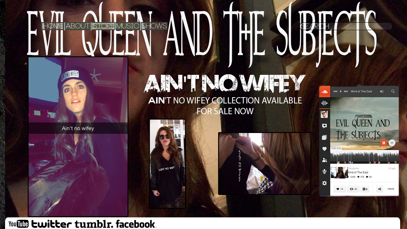

First of all, when I saw your website pages initially I was extremely impressed. They are so eye catching that even if I were not assigned to comment on them, I would have taken the time to look at them. Focusing on the “Store” page I really enjoy that instead of making the background a tradition block color or shape, you took the time to figure out what picture would fit nicely in the background. I also thought that the font you used for your header was really effective for the type of band you were trying to portray, which I am going to guess was some sort of gothic genre. Plus, this element was really effective in uniting all of your pages. Another element that I thought was really clever was taking the time to make a mock snap chat. You can tell that you took the time to put a filter on it, as well as research the font used, to make it realistic. The third really impressive element about this page was that you took the time to recreate the sound cloud. Adding the pictures, as well as making the album art on top of it, makes it look extremely realistic. There are a few things I wish would be edited to help make the site more usable. First off, I wish the toolbar, aka the Home, About, Store, etc, was a little bit more readable. It took me a second to find this element and I was initially unsure how to navigate the website. Second I think the search bar should be a little more prominent. Maybe, move the bar up or down on the page, or make the background more opaque that way it becomes more readable. Throughout this page I enjoyed a lot of the photos presented. You had a variety of locations for this performer which adds a lot to how realistic the website looks. I also really appreciate that you took he time to write “Ain’t No Wifey” on each one of the performers shirts. You can tell that you even took the time to warp and erase parts of the album title to make it look more realistic. Overall, I think you did an awesome job.