Typography: The fonts you chose for you project worked with your story about your slow boat to China. The San serif font in the crow helps it look edgy adds to the moving forward traveling theme you have going on with the arrow. You kept the capitalization consistent throughout the spread and cover and the different font sizes catches your eye and emphasizes what is most important.
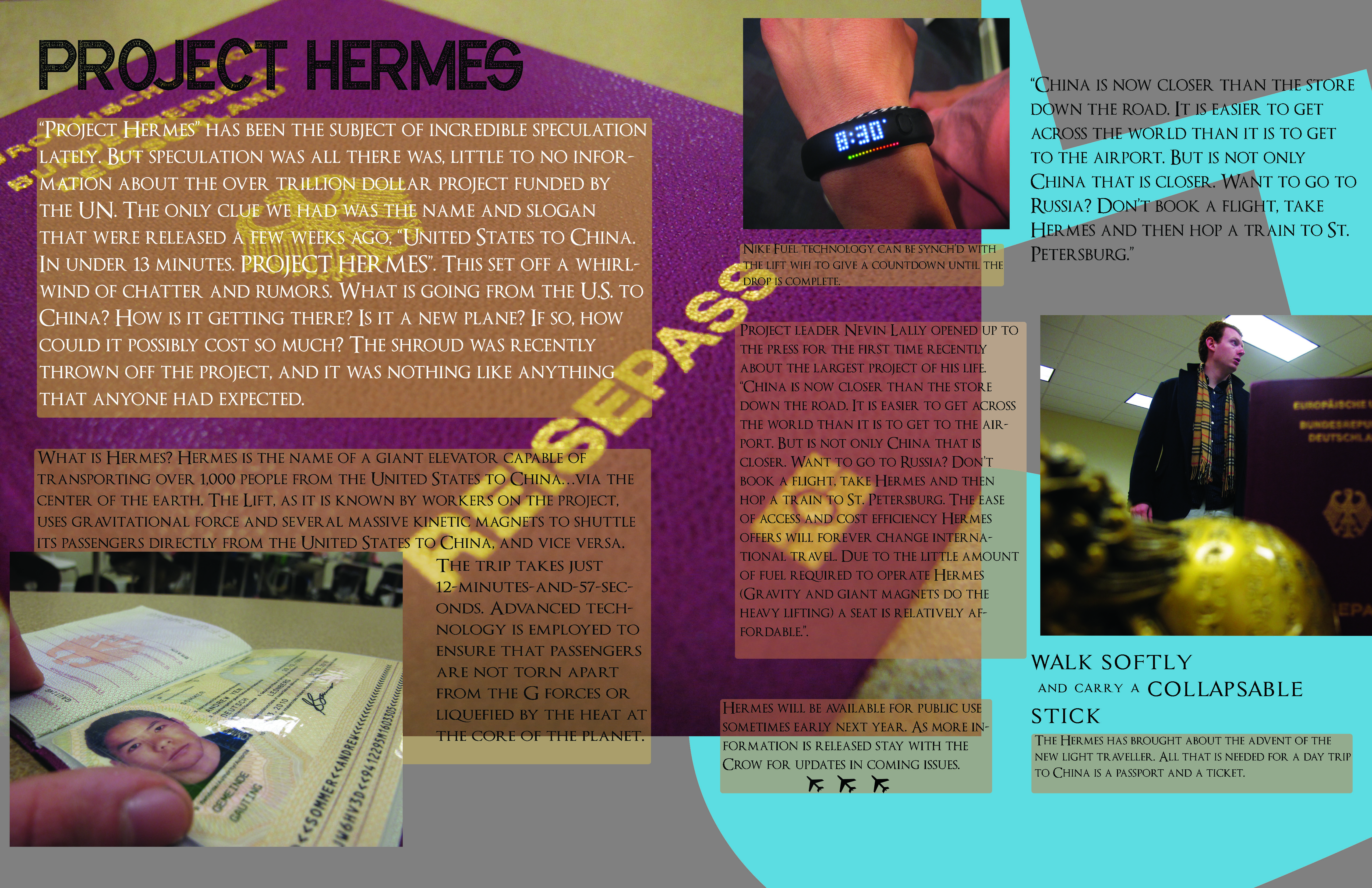
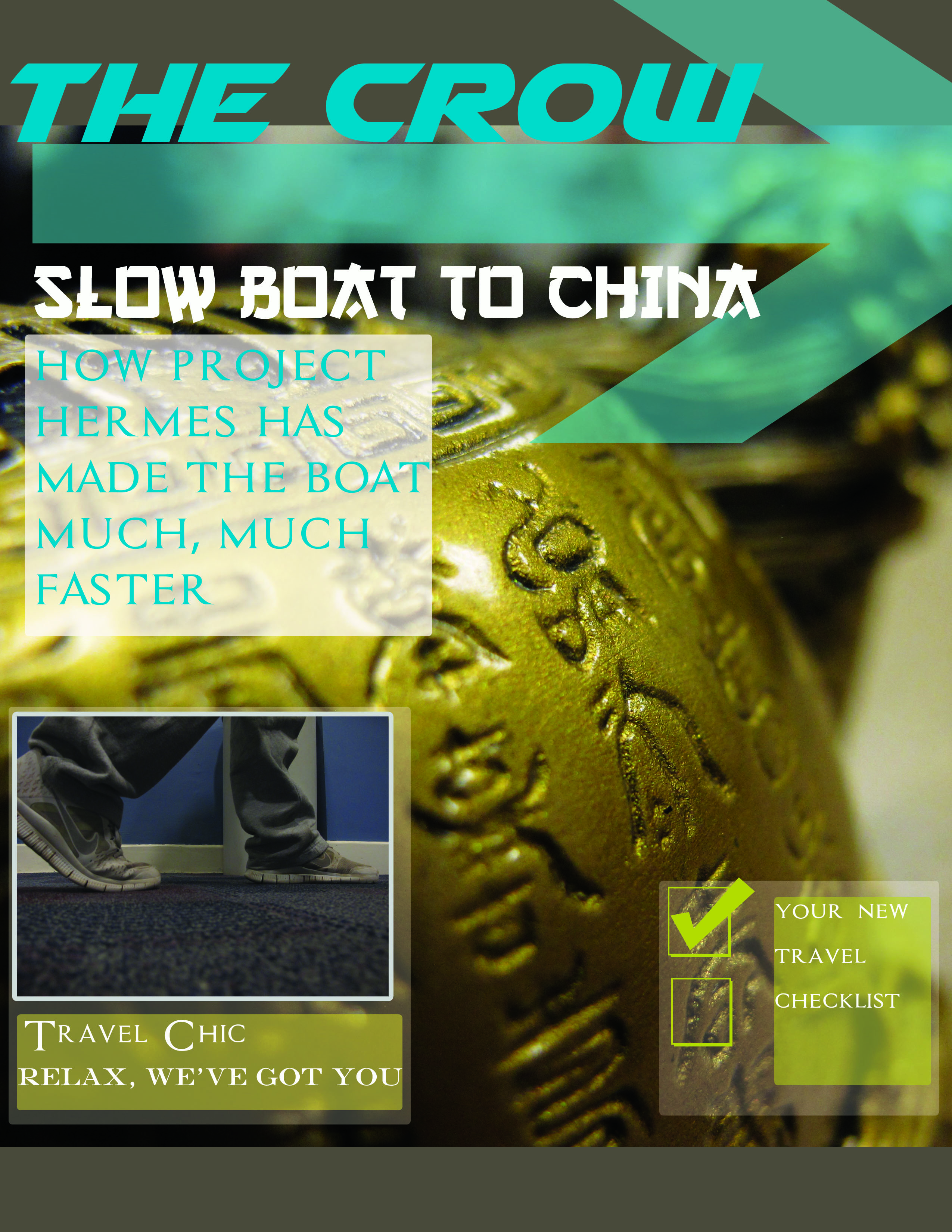
Composition: The overall composition of the cover and spread is nice beside the extra space at the bottom. You have a clever title and an interesting story. The symmetry of the squares on the cover is good but I wish the two on the left were aligned better. The picture of the guy walking is a good preview of what’s inside. I couldn’t tell if “The Crow” consistently covers the slow boat to China theme or it was just this edition. The spread is separated well in the middle. The opaque boxes was a great way to divide the article but it would’ve been nice if you would’ve made certain words stand out so if readers wanted to skim the article, they would get the idea of what it’s about. The background pictures and the shapes follow the color scheme.
Style, Color: Like I said above, the color scheme was consistent throughout. It was a little dark for me and made some of the words hard to read. The blue in the crow and the arrow on the cover are competing as well as the light blue and white in the opaque square on the left. I think your style was consistent and unique throughout. The cover especially looked like a magazine you would possibly see on a plan.
Photoshop Technique: I think you took advantage of the shapes and symbols in Photoshop to create a background for you spread and separate your article. Your pictures were not really enhanced in Photoshop and you could’ve brightened some them.
Photography: The pictures you included went well with your story but like I said above, you could’ve used Photoshop to make the pictures look more professional/ magazine quality. I like that you took different angles in the passport and person photos and I especially like the background picture on your cover.
Typography: The fonts you chose for you project worked with your story about your slow boat to China. The San serif font in the crow helps it look edgy adds to the moving forward traveling theme you have going on with the arrow. You kept the capitalization consistent throughout the spread and cover and the different font sizes catches your eye and emphasizes what is most important.
Composition: The overall composition of the cover and spread is nice beside the extra space at the bottom. You have a clever title and an interesting story. The symmetry of the squares on the cover is good but I wish the two on the left were aligned better. The picture of the guy walking is a good preview of what’s inside. I couldn’t tell if “The Crow” consistently covers the slow boat to China theme or it was just this edition. The spread is separated well in the middle. The opaque boxes was a great way to divide the article but it would’ve been nice if you would’ve made certain words stand out so if readers wanted to skim the article, they would get the idea of what it’s about. The background pictures and the shapes follow the color scheme.
Style, Color: Like I said above, the color scheme was consistent throughout. It was a little dark for me and made some of the words hard to read. The blue in the crow and the arrow on the cover are competing as well as the light blue and white in the opaque square on the left. I think your style was consistent and unique throughout. The cover especially looked like a magazine you would possibly see on a plan.
Photoshop Technique: I think you took advantage of the shapes and symbols in Photoshop to create a background for you spread and separate your article. Your pictures were not really enhanced in Photoshop and you could’ve brightened some them.
Photography: The pictures you included went well with your story but like I said above, you could’ve used Photoshop to make the pictures look more professional/ magazine quality. I like that you took different angles in the passport and person photos and I especially like the background picture on your cover.